Introduction
Creating an effective brochure design involves many elements, but one of the most crucial is color. The right color choices can make your brochure visually appealing, convey your message clearly, and attract your target audience. However, poor color choices can lead to color confusion, making your brochure look cluttered and unprofessional. In this blog, we will discuss how to avoid color confusion in brochure design and provide tips for creating a cohesive and impactful color scheme. Let’s dive in!
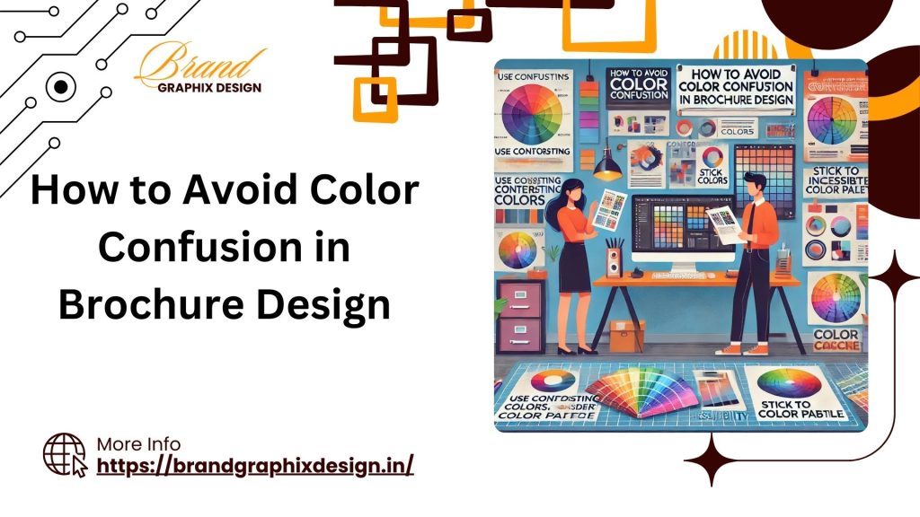
Understanding Color Confusion
Color confusion occurs when the colors used in your brochure clash or do not harmonize, making it difficult for readers to focus on the content. This can lead to a negative impression and reduce the effectiveness of your brochure. Here are some common causes of color confusion:
- Too Many Colors: Using too many colors can create a chaotic and overwhelming design.
- Poor Contrast: Lack of contrast between text and background colors can make the content hard to read.
- Clashing Colors: Colors that do not complement each other can create a jarring effect.
- Inconsistent Color Use: Inconsistent use of colors can make the design look disjointed and unprofessional.
Importance of a Cohesive Color Scheme
A cohesive color scheme is essential for creating a professional and visually appealing brochure. It helps to:
- Enhance Readability: A well-chosen color scheme improves readability and ensures that important information stands out.
- Convey Brand Identity: Consistent use of brand colors helps to reinforce your brand identity and create a memorable impression.
- Guide the Reader’s Eye: A cohesive color scheme guides the reader’s eye through the content, making it easier to follow and understand.
- Create Visual Harmony: Harmonious colors create a pleasing visual experience and make the brochure more engaging.
Tips to Avoid Color Confusion
Here are some tips to help you avoid color confusion and create an effective brochure design:
1. Limit Your Color Palette
Using too many colors can create a cluttered and confusing design. Limit your color palette to two or three main colors to create a cohesive look.
- Primary Colors: Choose one or two primary colors that reflect your brand and message.
- Accent Colors: Use accent colors sparingly to highlight important information and create visual interest.
2. Choose Complementary Colors
Complementary colors are colors that are opposite each other on the color wheel. They create a pleasing contrast and make the design more dynamic.
- Color Wheel: Use a color wheel to find complementary colors that work well together.
- Balance: Ensure that the colors are balanced and do not overpower each other.
3. Use High Contrast
High contrast between text and background colors improves readability and ensures that the content stands out.
- Dark on Light: Use dark text on a light background for better readability.
- Light on Dark: If using a dark background, make sure the text is light enough to be easily read.
4. Stick to Brand Colors
Using your brand colors consistently helps to reinforce your brand identity and create a cohesive look.
- Brand Guidelines: Follow your brand guidelines to ensure consistent use of colors.
- Recognition: Consistent use of brand colors helps to create a memorable and recognizable design.
5. Use Color Psychology
Colors can evoke emotions and convey messages. Use color psychology to choose colors that align with your message and resonate with your audience.
- Red: Red is associated with energy, passion, and excitement. Use it to grab attention and create a sense of urgency.
- Blue: Blue conveys trust, calmness, and professionalism. It is ideal for creating a sense of reliability and stability.
- Green: Green represents nature, health, and growth. Use it to convey eco-friendliness and well-being.
- Yellow: Yellow is associated with happiness, optimism, and warmth. Use it to create a cheerful and inviting look.
- Black: Black conveys luxury, sophistication, and elegance. It is often used for high-end and premium products.
6. Test Your Colors
Testing your color choices ensures that they look good in print and on screen. Make sure the colors are consistent and effective in different formats.
- Print Tests: Print test copies of your brochure to see how the colors look in real life. Adjust the colors if necessary to improve the print quality.
- Digital Tests: View your brochure on different devices to ensure the colors are consistent and look good on screen.
7. Use Color Tools
Color tools can help you choose the right colors and create a cohesive color scheme. Use these tools to experiment with different color combinations and find the best options for your brochure.
- Color Palettes: Use online color palette tools to create and test different color schemes.
- Color Pickers: Use color pickers to find specific colors and ensure consistency in your design.
Examples of Effective Color Use in Brochure Design
Here are some examples of brands that use color effectively in their brochure designs:
Apple
Apple’s brochures use a clean and minimalist color scheme with a focus on white space and high contrast. This creates a sleek and professional look that aligns with their brand identity.
Starbucks
Starbucks uses green as their primary brand color, which represents nature and health. Their brochures use green accents along with complementary colors to create a cohesive and inviting design.
Coca-Cola
Coca-Cola’s brochures use their iconic red color to create a sense of energy and excitement. The consistent use of red across their designs reinforces their brand identity and creates a memorable look.
Creating an effective brochure design involves careful consideration of color choices. By avoiding color confusion and using a cohesive color scheme, you can create a visually appealing and professional brochure that effectively conveys your message. If you need assistance with designing your brochure, feel free to contact us at +91 91189 11171 or send us a WhatsApp message for expert advice and support.