How Can Color and Typography Be Used Effectively in Brochures
Brochures are powerful marketing tools that combine visual appeal with informative content. Here’s how you can leverage color and typography to create effective brochures:
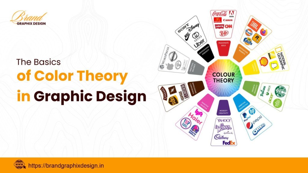
Choosing the Right Color Palette
- Select colors that align with your brand identity and evoke the desired emotions in your audience.
- Use contrasting colors for headlines and important information to make them stand out.
- Consider cultural connotations of colors to ensure they resonate with your target audience.
Typography for Readability and Impact
- Choose fonts that are legible and reflect the tone of your brand—serif fonts for a classic look, sans-serif for modern appeal.
- Use hierarchy in typography—headlines in larger, bold fonts and body text in smaller sizes for readability.
- Balance serif and sans-serif fonts to create visual interest and hierarchy in your brochure design.
Integrating Color and Typography Seamlessly
- Ensure that the color scheme complements the typography choices and vice versa.
- Avoid using too many colors or fonts that can overwhelm the reader—keep it simple and cohesive.
- Use colors to highlight key information and typography to guide the reader through the content.
Ready to create brochures that effectively use color and typography to communicate your message?
Contact us at +91 911 891 1171 to discuss how our design services can help you!