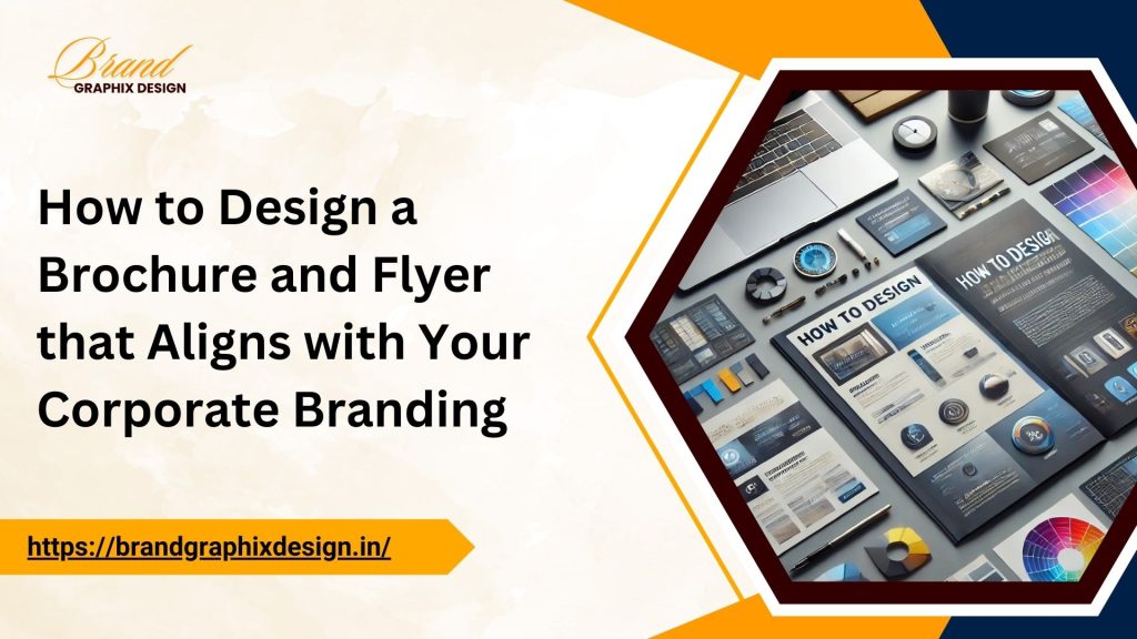
Introduction: The Importance of Corporate Branding in Brochures and Flyers
Your corporate brand represents who you are, what you do, and how customers perceive you. In today’s competitive market, having strong, consistent branding is more important than ever. Whether it’s your website, business card, or marketing materials, everything should align with your brand identity. One of the key components of a branding strategy is the design of brochures and flyers. These materials serve as the first point of contact for many potential clients. To make a lasting impression, they must reflect your company’s vision, values, and identity.
In this guide, we will discuss how to design brochures and flyers that perfectly align with your corporate branding, ensuring they capture attention, build trust, and create recognition for your business.
1. Define Your Brand Identity Before Starting the Design
The first step in designing a brochure or flyer that aligns with your corporate branding is to clearly define your brand identity. This involves understanding your company’s core values, vision, mission, and unique selling points (USPs). Are you a luxury brand or a budget-friendly service provider? Do you emphasize innovation, tradition, or sustainability? Understanding these aspects will shape every design decision, from color schemes to fonts and imagery.
Ensure that your design communicates these key elements. For instance, if your brand focuses on eco-friendliness, use green color tones and natural imagery in your flyer and brochure. If innovation is your strength, use modern, clean designs with sleek fonts.
2. Use Consistent Brand Colors
Brand colors play a significant role in creating a strong visual identity. When designing brochures and flyers, it’s important to use the same color palette that’s associated with your company. Consistency in color not only makes your design look professional but also helps in building brand recognition.
For example, if your corporate colors are blue and white, use these shades in the backgrounds, borders, and key sections of your flyer or brochure. Avoid using colors that clash with your brand. Color consistency will make it easier for people to immediately recognize your materials and associate them with your company.
3. Choose Fonts That Reflect Your Brand Personality
Fonts are more than just letters on a page. They convey emotion, professionalism, and the personality of your brand. For instance, a law firm may use traditional serif fonts to communicate trust and professionalism, while a tech startup might choose modern, sans-serif fonts to represent innovation and simplicity.
It’s important to choose a font that aligns with your overall brand identity. Ensure that the fonts used in your brochures and flyers match those on your website, social media, and other marketing materials. Additionally, avoid using more than two to three font types in your design to keep it looking clean and professional.
4. Incorporate Your Logo in the Right Places
Your logo is the face of your brand. When designing brochures and flyers, it’s crucial to place your logo in strategic spots where it can be easily seen but doesn’t overpower the rest of the content. Typically, placing your logo at the top or bottom of the brochure or flyer works best.
Make sure the logo size is proportionate to the overall design. It should be prominent but not the focal point of the brochure. A small, well-placed logo can create a subtle but lasting impression.
5. Align the Design with Your Corporate Tone of Voice
In addition to visual elements, your corporate tone of voice should be reflected in the copy of your brochures and flyers. Are you aiming for a formal or casual tone? Your brand’s voice could be authoritative, friendly, playful, or inspirational. The tone you choose will guide how you phrase your key messages.
If your business adopts a professional tone, avoid using overly casual phrases in your brochure or flyer. On the other hand, if your brand tone is friendly and approachable, keep the language simple and conversational. This consistency in voice across all your materials will build trust with your audience and create a cohesive brand image.
6. Keep the Design Simple and Focused
Incorporating too many elements in your brochure or flyer design can make it look cluttered and confusing. Instead, keep the layout simple and focused. Use white space effectively to highlight important information, making it easier for readers to scan and absorb the content.
A brochure or flyer should not overwhelm the reader with too much information. Instead, highlight the key points that align with your brand message. Make sure to keep the design clean and ensure that the most critical information stands out.
7. Use High-Quality Images that Reflect Your Brand
Images play a powerful role in your brochure or flyer design, and it’s essential that they align with your corporate branding. Low-quality or irrelevant images can harm your brand’s reputation and make your marketing materials look unprofessional.
Choose high-quality images that reflect your brand values. For example, if you’re a travel company, use beautiful, high-resolution photos of destinations you offer. If you’re a food brand, feature appealing images of your dishes. The images you select should be consistent with the message you want to convey and should reinforce your brand identity.
8. Maintain Consistent Layout and Design Across All Brochures and Flyers
When designing multiple brochures or flyers, ensure that the layout and design are consistent across all materials. This helps create a uniform brand identity and makes it easier for customers to recognize your brand at a glance.
Consistency also extends to the placement of elements like logos, headings, and images. Avoid making each brochure or flyer look drastically different from the others, as it can confuse customers. Instead, create a template or design system that can be applied to all your marketing materials for a cohesive look.
9. Use Catchy Headlines that Reflect Your Brand
The headline is often the first thing that people see when they look at your brochure or flyer, so it should grab attention and reflect your brand message. A great headline not only catches the eye but also gives a clear idea of what your company is offering.
For example, if your brand focuses on providing high-quality, affordable services, your headline could emphasize value, such as “Top-Notch Service at Affordable Rates.” If your brand is all about innovation, your headline could highlight that, like “Discover the Future of Technology Today.”
Remember, the headline should align with your corporate branding and set the tone for the rest of the content.
Don’t Forget to Add One!
A well-designed brochure or flyer isn’t complete without a strong call to action (CTA). Whether it’s directing customers to visit your website, call your business, or attend an event, the CTA should be clear, concise, and aligned with your brand voice.