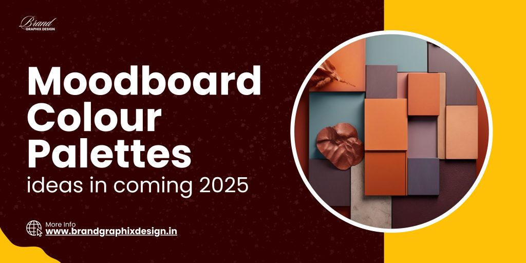
In the world of design, moodboards and colour palettes play a crucial role in setting the tone and direction of a project. Whether you’re designing a brand, a website, or even a room, choosing the right colours and creating a moodboard can make a huge difference. As we look ahead to 2025, new trends in colour palettes are emerging, offering fresh inspiration for designers, marketers, and creators. In this blog, we’ll explore 25 moodboard and colour palette ideas that are set to dominate in 2025, helping you stay ahead of the curve and create stunning designs.
1. Earthy Tones for a Natural Vibe
Earthy tones are making a strong comeback in 2025. These colours, inspired by nature, bring warmth and comfort to any design. Think shades of brown, terracotta, olive green, and sandy beige. These colours are perfect for brands that want to convey a natural, organic, or eco-friendly vibe.
- Combine warm browns with soft greens for a grounded feel.
- Add a touch of terracotta to bring warmth to your design.
- Use sandy beige as a neutral base to balance the palette.
2. Soft Pastels for a Calm and Soothing Look
Pastels continue to be a favourite in 2025, offering a calm and soothing aesthetic. Soft shades of pink, lavender, mint green, and baby blue can create a serene and welcoming mood. These colours are ideal for brands in the beauty, wellness, or lifestyle sectors.
- Pair pastel pink with mint green for a fresh and airy look.
- Use lavender and baby blue for a calming, harmonious vibe.
- Incorporate soft neutrals to add depth to the palette.
3. Bold and Vibrant Colours for Maximum Impact
If you want to make a statement in 2025, bold and vibrant colours are the way to go. Bright reds, electric blues, and neon greens are perfect for grabbing attention and making your design stand out. These colours are ideal for brands targeting a young, energetic audience.
- Combine electric blue with neon green for a striking contrast.
- Use bold reds as accent colours to add energy to your design.
- Balance vibrant colours with neutral tones to avoid overwhelming the viewer.
4. Monochrome Magic for a Timeless Look
Monochrome colour schemes are always in style, and 2025 is no exception. A black-and-white palette creates a timeless, elegant look that can be adapted to various design styles. Whether you’re going for a minimalist aesthetic or a bold, graphic look, monochrome is a versatile choice.
- Use varying shades of black and grey for depth and interest.
- Add white accents to create contrast and highlight key elements.
- Consider a monochrome colour palette for a clean, sophisticated look.
5. Sunset Hues for a Warm and Inviting Feel
Sunset-inspired hues, like warm oranges, soft pinks, and deep purples, are set to be popular in 2025. These colours evoke feelings of warmth and relaxation, making them perfect for designs that aim to create a welcoming, cozy atmosphere.
- Combine warm oranges with soft pinks for a harmonious palette.
- Use deep purples as an accent to add depth and richness.
- Create a gradient effect to mimic the natural transition of sunset colours.
6. Minimalist Neutrals for a Clean Aesthetic
Minimalist designs continue to dominate, and neutral colour palettes are key to achieving this look. Shades of grey, beige, and white are perfect for creating a clean, uncluttered aesthetic that feels modern and sophisticated.
- Pair different shades of grey for a sleek, contemporary look.
- Add beige tones to bring warmth and softness to the palette.
- Use white as the dominant colour to maintain a minimalist vibe.
7. Moody Blues for a Sophisticated Touch
Moody blues are set to be a major trend in 2025. Deep navy, stormy grey-blue, and soft denim shades bring a sense of sophistication and depth to any design. These colours are ideal for brands looking to convey trust, reliability, and calmness.
- Combine deep navy with soft denim for a layered, textured look.
- Use grey-blue tones to add a modern twist to classic blue hues.
- Incorporate metallic accents like silver or gold to elevate the palette.
8. Retro Revival for a Nostalgic Vibe
Retro colours are making a comeback in 2025, with a focus on bold, nostalgic hues like mustard yellow, burnt orange, and avocado green. These colours bring a playful, vintage feel to your design and are perfect for brands that want to tap into a sense of nostalgia.
- Use mustard yellow and burnt orange for a warm, inviting palette.
- Add avocado green to create a balanced, retro-inspired look.
- Incorporate vintage patterns and textures to enhance the nostalgic vibe.
9. Jewel Tones for Rich and Luxurious Designs
Jewel tones are set to shine in 2025, with rich hues like emerald green, sapphire blue, and ruby red taking centre stage. These colours exude luxury and opulence, making them perfect for high-end brands and designs that aim to convey a sense of sophistication and elegance.
- Combine emerald green with sapphire blue for a regal look.
- Use ruby red as an accent colour to add warmth and richness.
- Pair jewel tones with metallics like gold or copper for an added touch of luxury.
10. Desert Tones for a Warm and Earthy Feel
Inspired by the natural colours of the desert, this palette includes warm, earthy tones like sandy beige, terracotta, and deep browns. These colours create a grounded, natural aesthetic that’s perfect for brands focusing on sustainability or outdoor lifestyles.
- Use sandy beige and terracotta for a warm, inviting palette.
- Add deep browns to bring depth and richness to the design.
- Incorporate natural textures like wood or stone to enhance the earthy vibe.
11. Neon Brights for a Bold and Energetic Look
Neon colours are back in 2025, bringing energy and vibrancy to any design. Electric pinks, neon greens, and bright yellows are perfect for brands that want to make a bold statement and attract attention.
- Pair neon pink with bright yellow for a fun, energetic palette.
- Use neon green as an accent colour to add a modern twist.
- Balance neon colours with black or white to avoid overwhelming the design.
12. Soft Greys and Blush for an Elegant Aesthetic
Soft greys paired with blush pinks create a delicate and elegant palette that’s perfect for sophisticated designs. This colour combination is ideal for brands in the beauty, fashion, or wedding industries, where a subtle, refined look is desired.
- Combine soft grey with blush pink for a gentle, harmonious palette.
- Add white accents to create a fresh, clean look.
- Use metallics like rose gold to add a touch of luxury.
13. Oceanic Blues for a Fresh and Invigorating Feel
Ocean-inspired blues, ranging from deep navy to aqua, bring a fresh, invigorating feel to your design. These colours are perfect for brands related to travel, adventure, or wellness, where a sense of calm and exploration is key.
- Pair deep navy with aqua for a dynamic, oceanic palette.
- Add soft seafoam green to create a more calming effect.
- Incorporate natural textures like wood or sand to enhance the coastal vibe.
14. Autumn Hues for a Cozy and Inviting Look
Autumn-inspired colours, like warm oranges, deep reds, and golden yellows, create a cozy, inviting aesthetic that’s perfect for the cooler months. These colours evoke feelings of warmth and comfort, making them ideal for seasonal campaigns or brands that want to convey a sense of homeliness.
- Combine warm oranges with deep reds for a rich, autumnal palette.
- Add golden yellow to bring brightness and warmth to the design.
- Use natural textures like wool or wood to enhance the cozy feel.</ li>
15. Cool Greens for a Fresh and Modern Aesthetic
Cool greens, like mint, teal, and sage, are set to be popular in 2025. These colours create a fresh, modern aesthetic that’s perfect for brands focused on health, wellness, or sustainability. Cool greens bring a sense of calm and clarity to your design.
- Pair mint green with teal for a fresh, contemporary palette.
- Add sage green to create a more grounded, earthy feel.
- Use white or grey as a neutral base to balance the palette.
16. Vintage Florals for a Feminine and Romantic Vibe
Inspired by vintage floral patterns, this colour palette includes soft pinks, dusty blues, and muted greens. These colours create a feminine, romantic aesthetic that’s perfect for brands in the fashion, beauty, or wedding industries.
- Use soft pinks and dusty blues for a delicate, vintage-inspired palette.
- Add muted greens to bring a natural, organic feel to the design.
- Incorporate floral patterns or textures to enhance the romantic vibe.
17. Urban Greys for a Modern, Industrial Look
Urban-inspired greys, combined with black and metallic accents, create a modern, industrial aesthetic. This colour palette is perfect for brands in tech, architecture, or any industry that values a sleek, contemporary look.
- Pair different shades of grey for a modern, urban feel.
- Add black or metallic accents to create contrast and interest.
- Use minimalistic designs to complement the industrial vibe.
18. Tropical Brights for a Fun and Playful Look
Tropical colours, like bright pinks, vibrant yellows, and lush greens, bring a fun, playful vibe to your design. These colours are perfect for brands in the travel, leisure, or lifestyle industries that want to convey a sense of adventure and excitement.
- Combine bright pinks with vibrant yellows for a lively, tropical palette.
- Add lush greens to bring a natural, organic feel to the design.
- Use bold patterns or textures to enhance the playful vibe.
19. Rustic Browns for an Earthy, Natural Aesthetic
Rustic browns, combined with earthy greens and deep oranges, create a warm, natural aesthetic that’s perfect for brands focused on sustainability, outdoor lifestyles, or organic products. These colours bring a sense of grounding and authenticity to your design.
- Pair rustic browns with earthy greens for a grounded, natural palette.
- Add deep oranges to bring warmth and richness to the design.
- Incorporate natural textures like wood or stone to enhance the earthy vibe.
20. Bold Black and Gold for a Luxurious Look
Black and gold is a classic colour combination that exudes luxury and sophistication. This palette is perfect for high-end brands or designs that aim to convey a sense of opulence and exclusivity.
- Use black as the dominant colour for a sleek, sophisticated look.
- Add gold accents to bring a touch of luxury and elegance.
- Consider metallic textures or finishes to enhance the opulent vibe.
21. Fresh Citrus for a Bright and Energizing Feel
Citrus-inspired colours, like bright oranges, zesty yellows, and fresh greens, bring a bright, energizing feel to your design. These colours are perfect for brands that want to convey freshness, vitality, and positivity.
- Combine bright oranges with zesty yellows for a vibrant, citrus-inspired palette.
- Add fresh greens to create a balanced, energizing look.
- Use white as a neutral base to highlight the bright, fresh colours.
22. Soft Lilac and Grey for a Gentle, Modern Look
Soft lilac combined with shades of grey creates a gentle, modern aesthetic that’s perfect for brands in the fashion, beauty, or lifestyle industries. These colours bring a sense of calm and sophistication to your design.
- Pair soft lilac with light grey for a gentle, harmonious palette.
- Add darker shades of grey to create contrast and depth.
- Use white or silver accents to enhance the modern, sophisticated vibe.
23. Aqua and Coral for a Fresh, Beachy Look
Aqua and coral create a fresh, beach-inspired palette that’s perfect for brands in the travel, leisure, or lifestyle industries. These colours bring a sense of relaxation and adventure, evoking the feeling of a tropical getaway.
- Combine aqua and coral for a bright, beachy palette.
- Add white or sandy beige to create a fresh, airy feel.
- Incorporate natural textures like wood or shells to enhance the coastal vibe.
24. Deep Burgundy and Gold for a Rich, Elegant Look
Deep burgundy combined with gold creates a rich, elegant aesthetic that’s perfect for high-end brands or designs that aim to convey luxury and sophistication. These colours bring a sense of warmth and opulence to your design.
- Use deep burgundy as the dominant colour for a warm, luxurious look.
- Add gold accents to bring a touch of elegance and richness.
- Consider using metallic finishes to enhance the opulent vibe.
25. Black and White with a Pop of Colour
Black and white, combined with a pop of bright colour, creates a modern, striking aesthetic. This palette is perfect for brands that want to make a bold statement while maintaining a sleek, contemporary look.
- Use black and white as the base colours for a clean, modern look.
- Add a pop of bright colour, like red, yellow, or blue, to create contrast and interest.
- Keep the overall design minimalistic to let the pop of colour stand out.
Create Stunning Designs with the Latest Colour Trends
As we move into 2025, these moodboard and colour palette ideas will help you stay ahead of the trends and create designs that resonate with your audience. Whether you’re rebranding, launching a new product, or simply looking for inspiration, the right colours can make all the difference. If you need professional help in creating moodboards or selecting the perfect colour palette for your project, we’re here to assist. Contact us today at +91 91189 11171 to bring your design vision to life.