

Getting your logo size right is more than just fitting it into a space—it’s about building a cohesive brand identity, ensuring clarity across devices, and establishing trust with your audience. Whether you’re crafting a new website or optimizing your social media profiles, properly sized logos help your brand look polished and professional everywhere it appears.
In this detailed guide, you’ll learn everything you need to know about choosing the ideal logo dimensions, selecting the best file formats, understanding placement strategies, and making your logos responsive across every major platform—whether viewed on a desktop monitor, mobile phone, or tablet device.
Why the Right Logo Size Matters
Your logo is typically the first visual element people associate with your brand, so choosing the right size is key to making a strong first impression.. Here’s why it makes a significant difference:
1. Polished and Professional Look
A logo that’s properly sized maintains its sharpness and detail. It prevents issues like blurry edges, pixelation, or parts getting cut off—all of which can make your brand appear unprofessional or inconsistent.
2. Improved Website Performance
Large image files, especially oversized logos, can significantly slow down your site. By resizing your logo appropriately, you improve loading speed, which helps reduce bounce rates and supports your SEO rankings.
3. Uniform Brand Identity Across Platforms
Consistent logo sizing ensures your brand is instantly recognizable, whether someone sees your logo on a website, Facebook page, or mobile app. It reinforces visual consistency, helping customers build familiarity and trust.
4. Mobile-Friendly and Responsive Design
With most users browsing on mobile devices, logos need to adapt fluidly to smaller screens. If your logo isn’t scaled correctly, it may appear cramped, stretched, or break your layout design. A responsive logo keeps your brand looking great on every screen size.
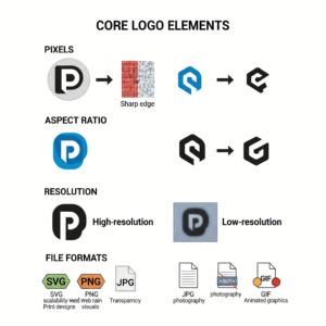
Core Logo Design Elements You Should Know
Before diving into logo dimensions, it’s essential to grasp the basic components that influence how your logo looks and performs across platforms:
1. Pixels (px)
Pixels are the standard unit for measuring digital images. They define the image’s height and width on screen—for example, a 400 × 200 px logo is 400 pixels wide and 200 pixels tall.
2. Aspect Ratio
It refers to the proportional relationship between the width and height of your logo. Maintaining a consistent aspect ratio ensures your logo doesn’t appear stretched or compressed when resized or displayed on different devices.
3. Resolution
Resolution determines the clarity of an image:
- A resolution of 72 PPI (pixels per inch) is commonly used for digital displays and web content.
- 300 DPI (Dots Per Inch) is used for high-quality print to keep your logo crisp and sharp.
4. File Formats
Each logo file type serves a specific purpose. Here are the most common:
- SVG (Scalable Vector Graphics): Best for websites. It’s resolution-independent, meaning your logo stays sharp at any size.
- PNG (Portable Network Graphics): Commonly used online, this format supports transparency and delivers crisp visuals, making it ideal for placing logos on various backgrounds without edges or boxes.
- JPG (Joint Photographic Experts Group): Good for images without transparency. Works well for colorful visuals, but not for logos needing a transparent background.
- GIF (Graphics Interchange Format): Best used for basic animated logos. It’s not ideal for static logos due to limited color support and lower image quality.

Ideal Logo Sizes for Websites
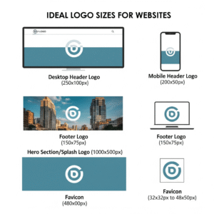
A website logo must fulfill multiple functional roles across different sections: branding, navigation, mobile UX, and identity retention. Here’s a more detailed breakdown with context:
1. Header Logo (Desktop)
- Recommended Size: 250 × 100 px
- Purpose: Serves as the primary visual element for brand recognition within the top navigation area.
- Best Practice: Ensure your logo maintains clarity even when resized to 200px width. This is the first thing users see—keep it simple and memorable.
- Visual Reference:
2. Mobile Header Logo
- Recommended Size: 200 × 50 px
- Purpose: Mobile screens demand a more compact version of your logo.
- Best Practice: Use an icon-only or horizontally condensed version.
- Visual Reference:
3. Footer Logo
- Recommended Size: 150 × 75 px
- Purpose: Reinforces brand identity without dominating the layout.
- Best Practice: A simple monochrome version works well for dark or minimal footers.
- Visual Reference:
4. Hero Section or Splash Logo
- Recommended Size: 1000 × 500 px
- Purpose: Used for large homepage banners or landing sections.
- Best Practice: Use a high-resolution SVG or PNG file. Ensure your typography scales properly and doesn’t blur.
- Visual Reference:
5. Favicon
- Recommended Size: 32 × 32 px to 48 × 48 px
- Purpose: Appears on browser tabs, bookmarks, and app shortcuts.
- Best Practice: Use an icon-only version or the first letter of your logo.
- File Format: PNG or ICO
- Visual Reference:
Pro Tip:
Create multiple versions of your logo: full (text + icon), icon-only, and stacked vertical. Use CSS breakpoints or auto-switching scripts to display the right one.
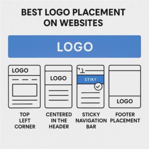
Best Practices for Logo Placement on Websites
Proper logo placement enhances branding and user navigation.
| Placement Area | Best Use |
| Top-Left Corner | Most common, aligns with reading pattern |
| Centered in Header | Good for minimalist or boutique brands |
| Sticky Navbar | Keeps branding persistent while scrolling |
| Footer | Reinforces branding without interfering with UX |
| Hero Section | Use large, clean version for impact |
Mobile Tip: Ensure the logo doesn’t cover CTA buttons or navigation icons. Simplicity is key.
Recommended Logo Sizes for Social Media Platforms (2025 Update)
Each platform crops, resizes, and compresses logos differently. Here’s the updated logo size guide for top platforms:
- Profile Picture: 180 x 180 px (Displays at 170 x 170 px on desktop)
- Cover Photo: 820 x 312 px
- Profile Picture: 320 x 320 px (Displays as a circle, keep logo centered)
🐦 Twitter (X)
- Profile Picture: 400 x 400 px
- Header Image: 1500 x 500 px
- Personal Profile Picture: 400 x 400 px
- Company Logo: 300 x 300 px
- Cover Photo: 1128 x 191 px
▶️ YouTube
- Profile Picture: 800 x 800 px (Displays as 98 x 98 px)
- Channel Art (Banner): 2560 x 1440 px (Safe area: 1546 x 423 px)
- Profile Picture: 165 x 165 px (Minimum 180 x 180 px recommended)
Note: Always test logos on both desktop and mobile previews. Social media platforms often compress images heavily, so it’s important to upload high-resolution, properly centered visuals for the best display quality.
Note: – Want to perfect your visual identity across platforms? Don’t miss our comprehensive article on the “Top 10 Social Media Graphic Design Mistakes to Avoid in 2025
How to Resize and Optimize Logos Without Losing Quality
1. Design in Vector Format
Begin with vector formats such as .SVG, AI, or EPS to ensure your logo scales perfectly without losing quality. These are scalable without pixelation and allow effortless resizing.
2. Export for Purpose
- PNG: Use for web/screen, supports transparency
- JPEG: Use for non-transparent, full-color backgrounds
- SVG: Use for modern websites and apps
- PDF: Best for print-ready versions
3. Maintain Proportions
Keep aspect ratios intact when resizing to avoid warped or stretched logos.
4. Use Smart Tools
- Canva & Figma: Great for responsive exports
- Adobe Illustrator: Professional control
- TinyPNG or ImageOptim: Compress file sizes without compromising clarity
Responsive Logo Design: Best Practices
1. Create Multiple Versions
- Horizontal layout for headers
- Vertical layout for square spaces or app icons
- Icon-only version for favicons and minimalist use
2. Use CSS Media Queries
@media (max-width: 768px) {
.logo {
width: 150px;
}
}
3. Test Across Devices
Ensure legibility and alignment on:
- Desktop (1920×1080)
- Tablet (768×1024)
- Mobile (360×640)
Choosing the Right Logo Format: File Types Explained
Each format serves a different need:
| Format | Use Case |
| PNG | Web display, transparent background |
| JPEG | High-res non-transparent images |
| SVG | Scalable vector for web, responsive and lightweight |
| EPS | Print and professional publishing |
| GIF | For animated logos or loading states |
Common Logo Sizing Mistakes to Avoid
- ❌ Uploading Raster Logos for Responsive Use
- ❌ Using Non-Transparent Backgrounds
- ❌ Using Only One Size for All Platforms
- ❌ Overcomplicating the Design
- ❌ Ignoring Favicon and Mobile Views
- ❌ Not Testing Across Browsers and Devices
Future Trends in Logo Sizing and Branding
1. Adaptive Logo Systems
Brands are now designing logos in systems—horizontal, stacked, icon-only versions—each optimized for a different platform.
2. Minimalist and Versatile Designs
Simple, clean logos work better across screen sizes and social feeds.
3. Dark Mode Compatible Logos
Designing alternative color versions to look great in dark mode interfaces.
4. Animated or Interactive Logos
Brands are increasingly adopting subtle logo animations on websites and app launch screens.
5. AI-Assisted Logo Scaling
Some platforms now auto-optimize your uploaded logo to meet platform requirements.
✅ Checklist to Follow:
- Choose the right dimensions for each platform
- Export in multiple formats (especially SVG for web)
- Test responsiveness on different devices
- Optimize file size and quality
- Prepare logo variants for various use cases
A well-sized, well-placed logo can make your brand unforgettable.
Final Thoughts
The size and format of your logo aren’t just technicalities—they’re branding power tools. By mastering logo sizing across websites and social media, you’re ensuring consistency, clarity, and professionalism.