

The Basics of Color Theory in Graphic Design
Understanding color theory is fundamental for any graphic designer. It’s not just about picking colors that look good together; it’s about understanding the emotions and messages colors convey. Here’s a beginner-friendly guide to color theory:
Primary Colors
- Primary colors are the building blocks of all other colors: red, blue, and yellow.
- They cannot be created by mixing other colors.
Secondary Colors
- Secondary colors are created by mixing two primary colors together:
- Red + Blue = Purple, Red + Yellow = Orange, Blue + Yellow = Green
- They are located between the primary colors on the color wheel.
Tertiary Colors
- Tertiary colors are created by mixing a primary color with a secondary color adjacent to it on the color wheel.
- Examples include red-orange, yellow-green, and blue-purple.
Color Harmonies
- Color harmonies are combinations of colors that are aesthetically pleasing to the eye.
- Common harmonies include complementary (opposite on the color wheel), analogous (next to each other), and triadic (equidistant on the color wheel).
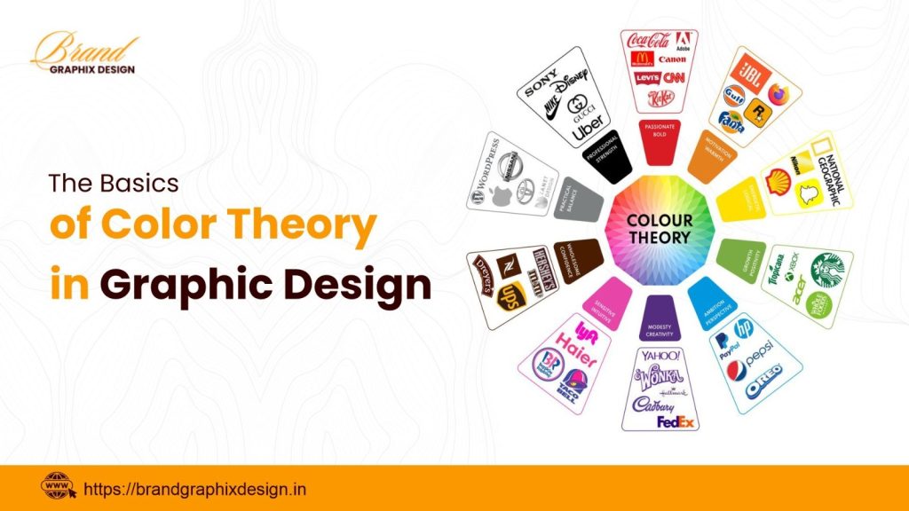
Psychology of Colors
- Colors evoke different emotions and have cultural meanings.
- For example, blue is calming and trustworthy, while red is energetic and bold.
Ready to apply color theory principles to your graphic design projects?
Contact us at +91 911 891 1171 to discuss how we can help you create visually appealing designs that resonate with your audience.