Texture in graphic design, and why flat brands feel cheap
Texture is the fastest way to make a design feel like something rather than look like something. Here is how it works, and where it earns its place in a brand system.
Two brands can use the same logo, the same typeface and the same colour, and one will feel expensive while the other feels like a template. Texture is usually the difference. It is the quality that makes a design feel like a made object rather than an arrangement of shapes.
Two kinds of texture
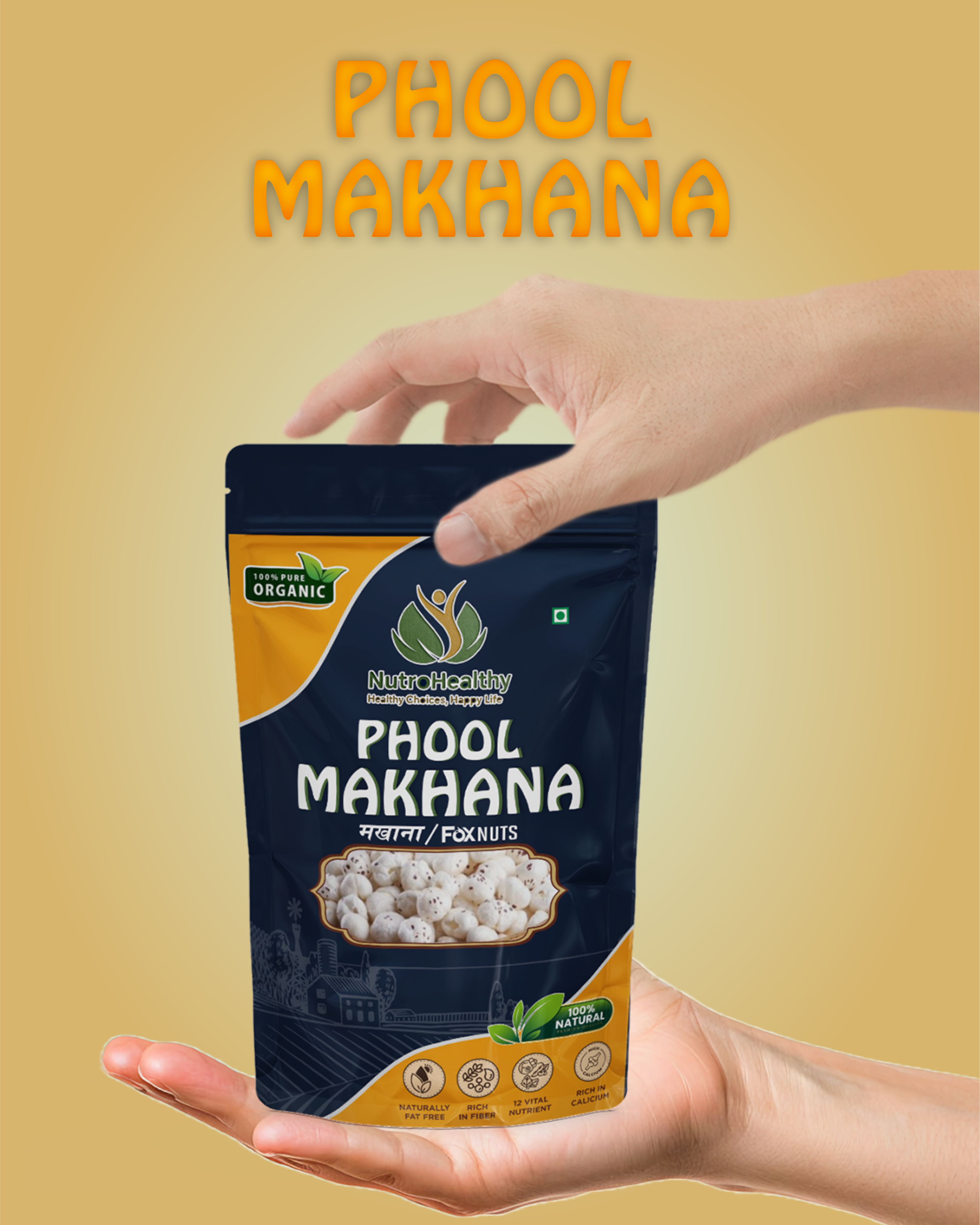
Tactile texture is real. It is the soft-touch laminate on a box, the deboss you can feel with a thumb, the weave of an uncoated stock. It exists in the physical world and is the reason a premium pack feels premium before anyone has read a word on it.
Visual texture is the impression of surface on a flat plane. Grain, paper fibre, halftone dots, film noise, subtle gradients standing in for light falling across a material. It works because we read those cues as physical even when we know we are looking at a screen.
Most brand work needs both, and the discipline is making them agree. A pack with a genuinely tactile finish and a website that is completely flat will feel like two different companies.
What texture actually does
- It creates hierarchy without adding elements. A textured background pushes back and lets clean type come forward, which is often cheaper than adding another graphic device.
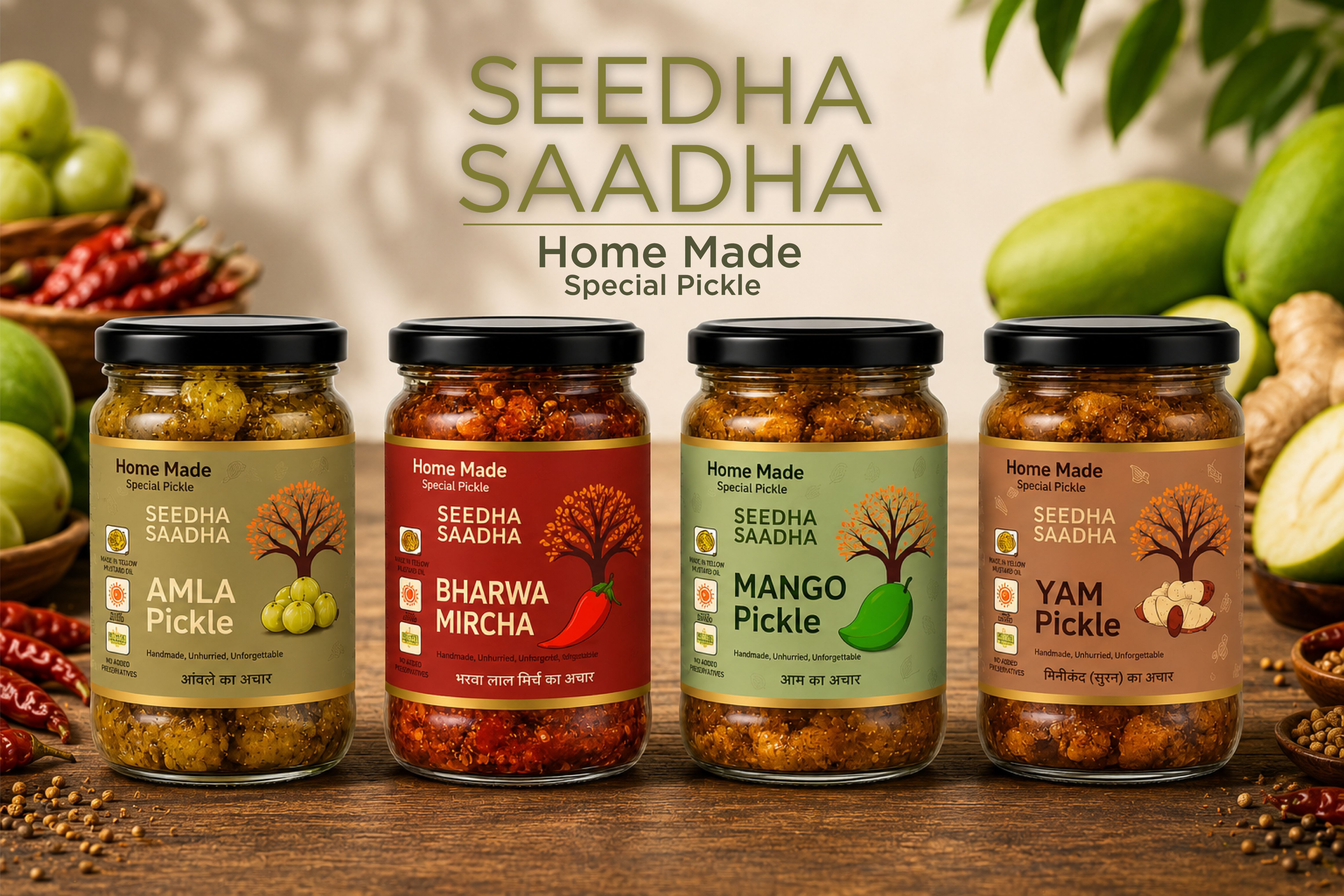
- It signals category and price. Uncoated, fibrous and imperfect reads as natural and artisanal. Smooth, dark and matte reads as premium and considered.
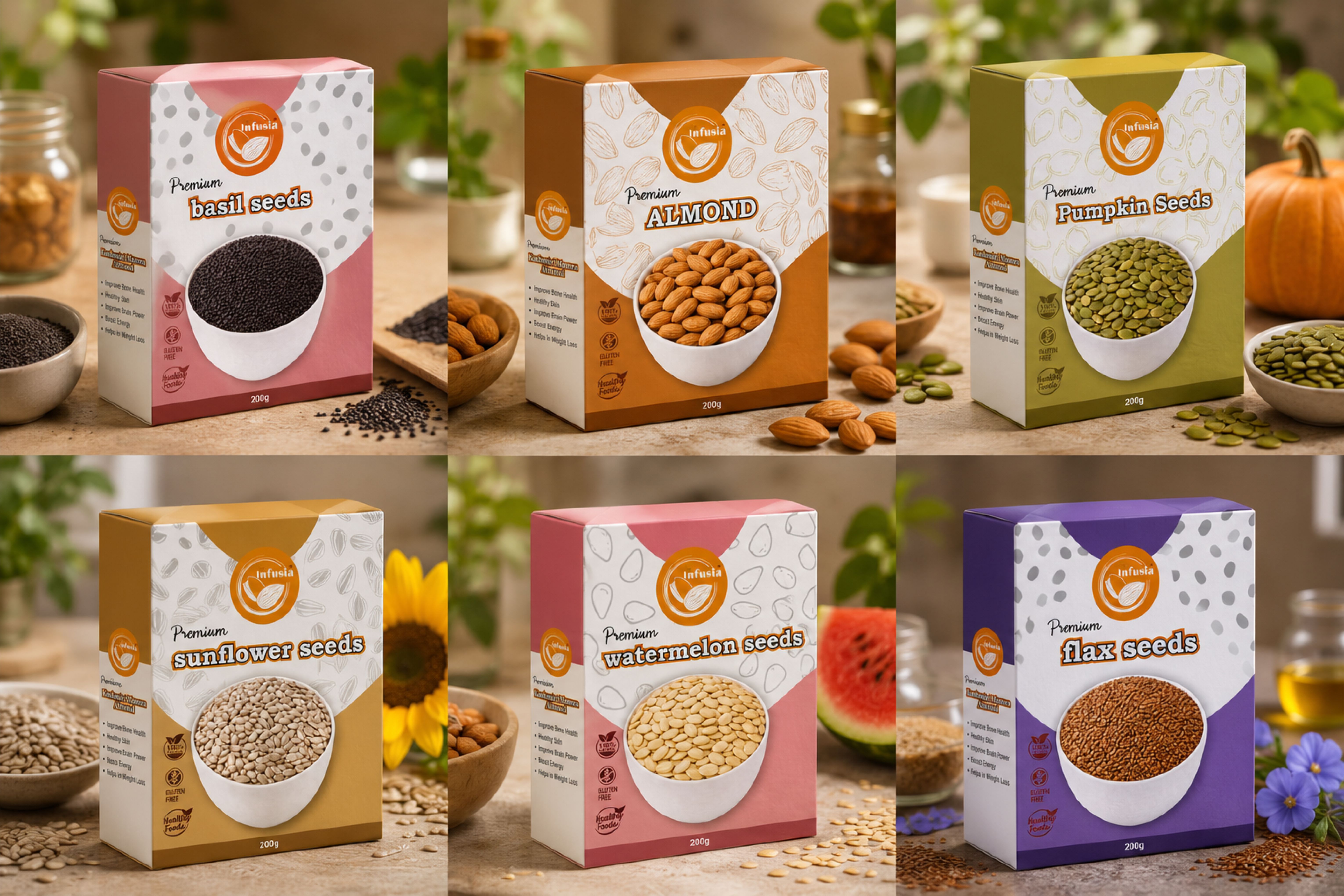
- It becomes a distinctive asset. A texture used consistently is recognisable on its own, in the same way a colour is.
- It carries a story. Provenance, craft and process are hard to claim in copy and easy to communicate through surface.
Texture is what stops a brand looking like a template someone filled in.
Where texture goes wrong
The failure mode is decoration. Texture applied because a layout felt empty adds noise and nothing else, and it usually shows up first as illegible text sitting on a busy background.
The second failure is scale. A grain that looks beautiful at full size becomes a muddy smear at thumbnail, and a texture designed for a large print run can disappear entirely on screen. If your product is sold as a small image in a marketplace grid, every texture decision has to survive that view.
The third is inconsistency. Texture chosen per project rather than defined once in the brand system produces a set of assets that each look fine and collectively look unrelated.
Putting texture in the system
Treat texture the way you would treat colour or type: choose it deliberately, define it, and use it the same way everywhere.
- 01Pick a small set. One primary surface and perhaps one accent. More than that and none of them becomes ownable.
- 02Define where each is used, and where nothing is used. Restraint is part of the system.
- 03Set contrast rules so text remains legible wherever texture appears behind it.
- 04Test at the smallest size the brand appears, then at the largest.
- 05Specify the physical equivalent: the stock, the finish, the varnish. That is where the digital texture stops being an effect and starts being the brand.
Done this way, texture stops being a styling choice made late and becomes one of the things people recognise you by, which is the only real test of any brand asset.